PyTorch Geometric (PyG) is a library for geometric deep learning, and W&B works with it for visualizing graphs and tracking experiments. This guide shows you how to authenticate to W&B, install theDocumentation Index
Fetch the complete documentation index at: https://wb-21fd5541-style-guide-models-integrations-20260527-015516.mintlify.app/llms.txt
Use this file to discover all available pages before exploring further.
wandb library, visualize PyG graphs with PyVis or Plotly, and log training metrics from your PyG workflows. It’s intended for PyG users who want to track experiments and share graph visualizations in W&B.
After you install PyTorch Geometric, follow these steps to get started.
Sign up and create an API key
An API key authenticates your machine to W&B. You can generate an API key from your user profile.For a more streamlined approach, create an API key by going directly to User Settings. Copy the newly created API key immediately and save it in a secure location such as a password manager.
- Click your user profile icon in the upper right corner.
- Select User Settings, then scroll to the API Keys section.
Install the wandb library and log in
To install the wandb library locally and log in:
- Command Line
- Python
- Python notebook
-
Set the
WANDB_API_KEYenvironment variable to your API key. -
Install the
wandblibrary and log in.
Visualize the graphs
After you log in, you can begin sending graph visualizations and run data to W&B. You can save details about the input graphs, including number of edges, number of nodes, and more. W&B supports logging Plotly charts and HTML panels, so you can also log any visualizations you create for your graph to W&B. The following sections show two common approaches: PyVis for interactive HTML visualizations and Plotly for chart-based visualizations.Use PyVis
The following snippet shows how to do that with PyVis and HTML.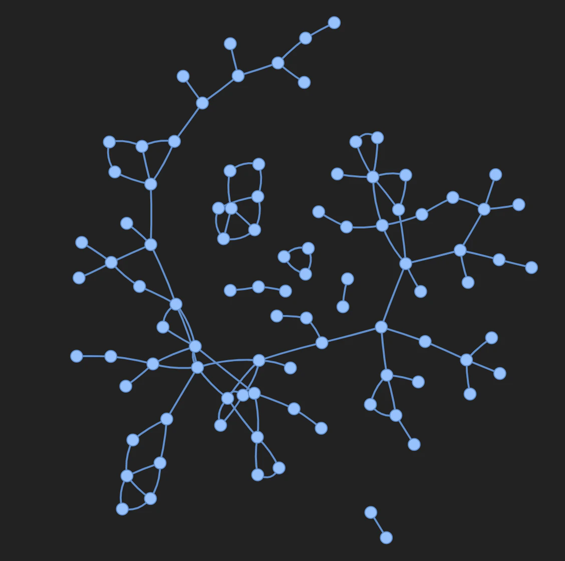
Use Plotly
To use Plotly to create a graph visualization, first convert the PyG graph to a networkx object. Then create Plotly scatter plots for both nodes and edges. Use the following snippet for this task.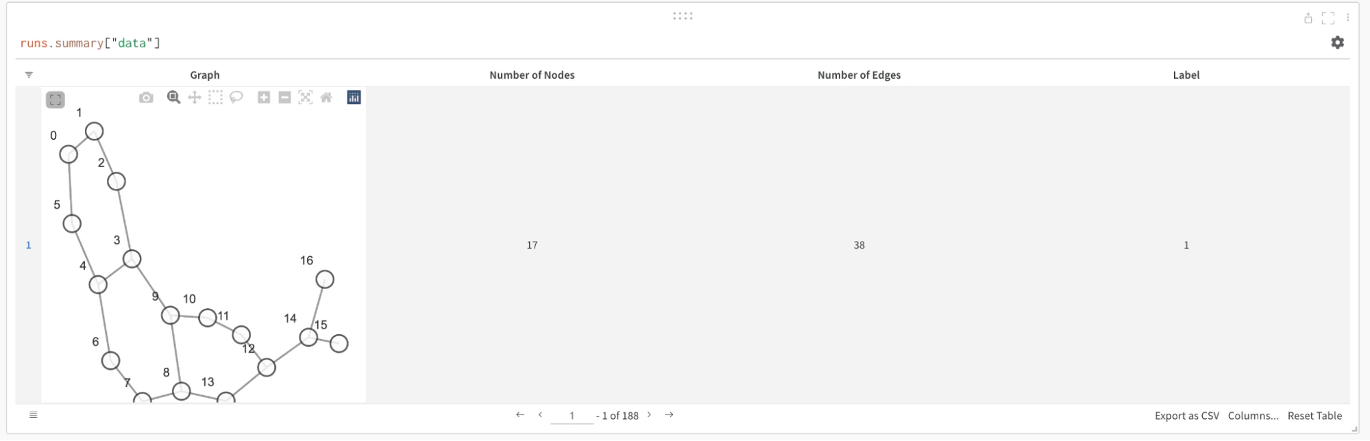
Log metrics
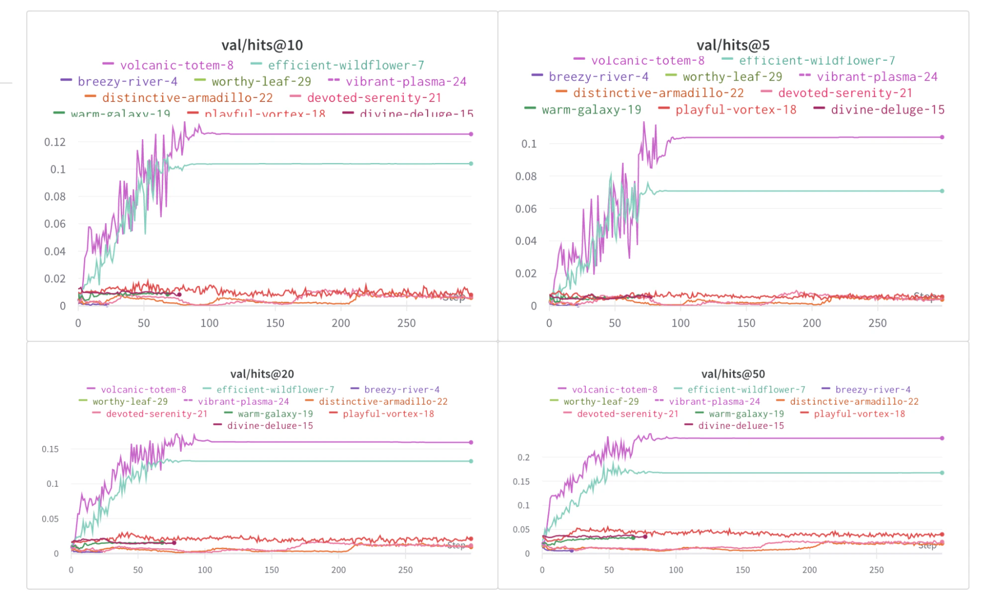
In addition to graph visualizations, you can use W&B to track your experiments and related metrics, such as loss functions, accuracy, and more. Add the following lines to your training loop: